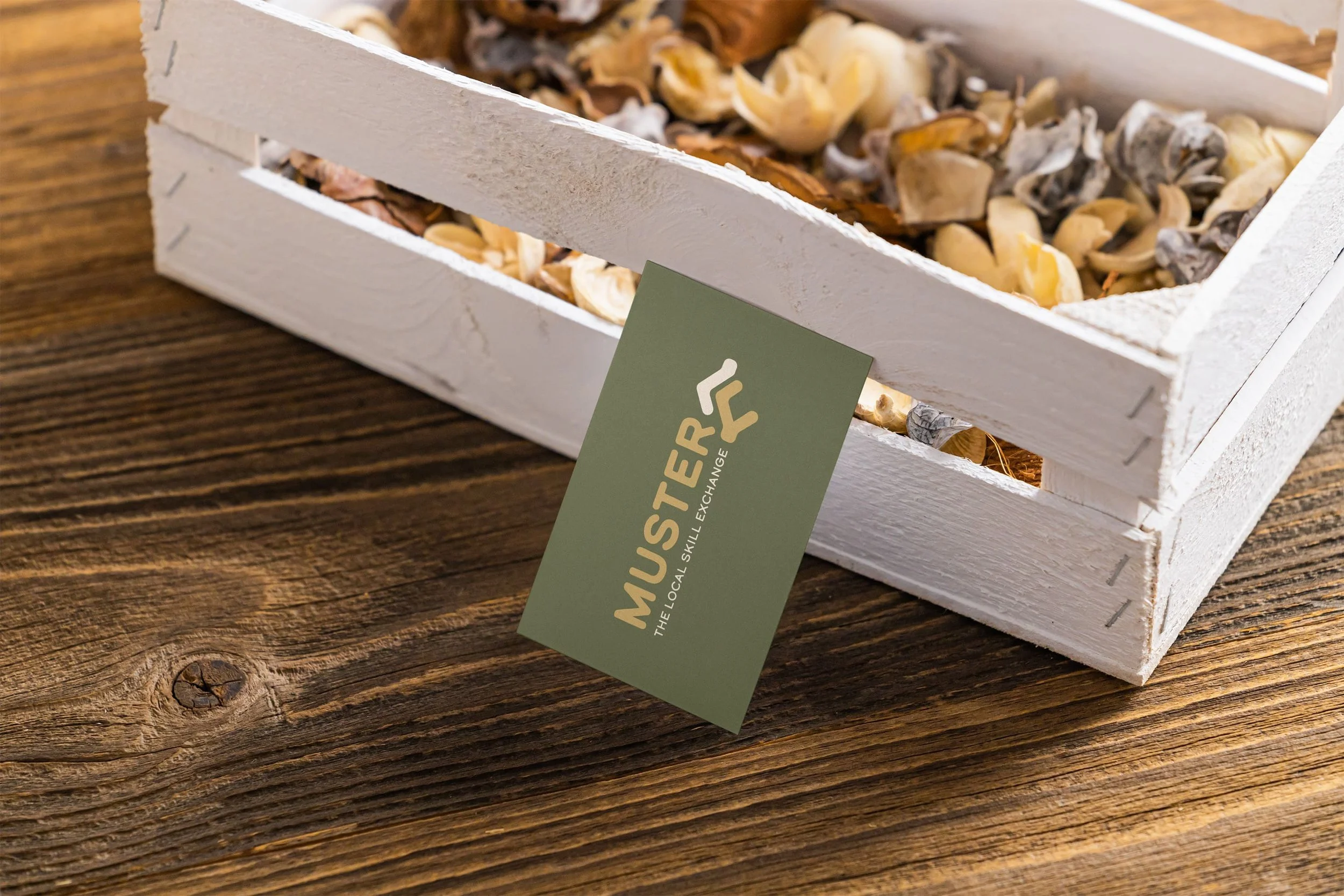
muster
Role: Designer
Type: Visual Identity
Year: 2026
Designing a Community-Led Skills Exchange for Local Resilience
Muster was created as a professional, trustworthy skills exchange for the Wattle Creek community, designed to strengthen local resilience through practical connection. The challenge was to build a brand that felt credible and competent, while remaining warm, approachable, and deeply rooted in place.
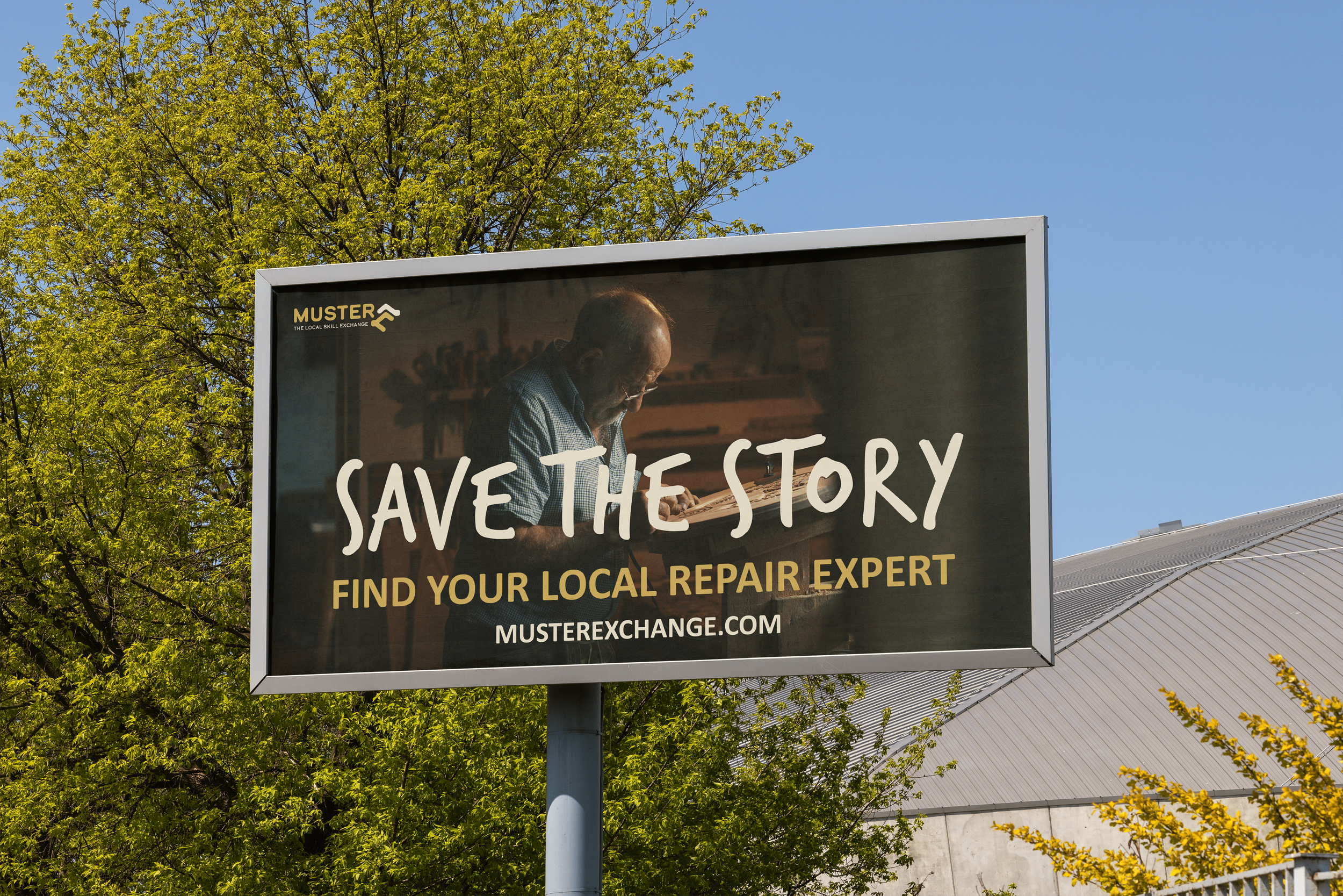
At its core, Muster exists to counter disposable culture by connecting residents who need help repairing or maintaining items with verified locals who have the skills to do so. From carpentry and IT to textile repair, the platform encourages people to value what they already own and the knowledge within their own community. This philosophy is captured in the guiding message: “Save the Story”.
The design brief centered on creating a modern, recognizable identity that could unify physical and digital touchpoints, earn trust quickly, and feel distinctly rural without feeling outdated or nostalgic.
-
The process began with defining the emotional and cultural context of Wattle Creek. Moodboarding was used to explore rural textures, colours, and references, helping establish a visual direction that felt grounded, capable, and familiar to the local community.
Early concept work focused on the idea of connection, mutual support, and practical competence. Logo sketches explored themes of helping hands, shared tools, and collaboration, which were refined into an abstract mark.
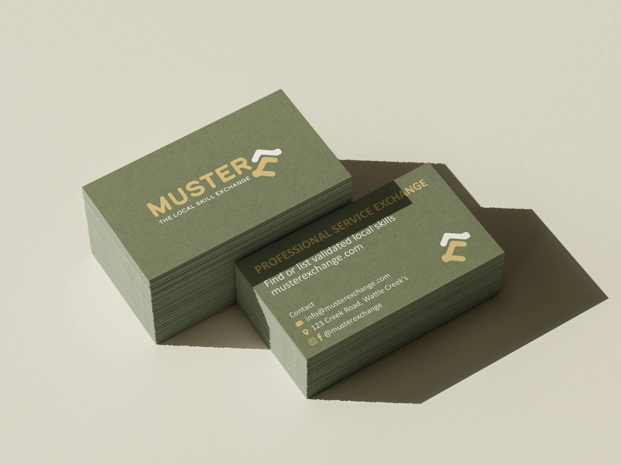
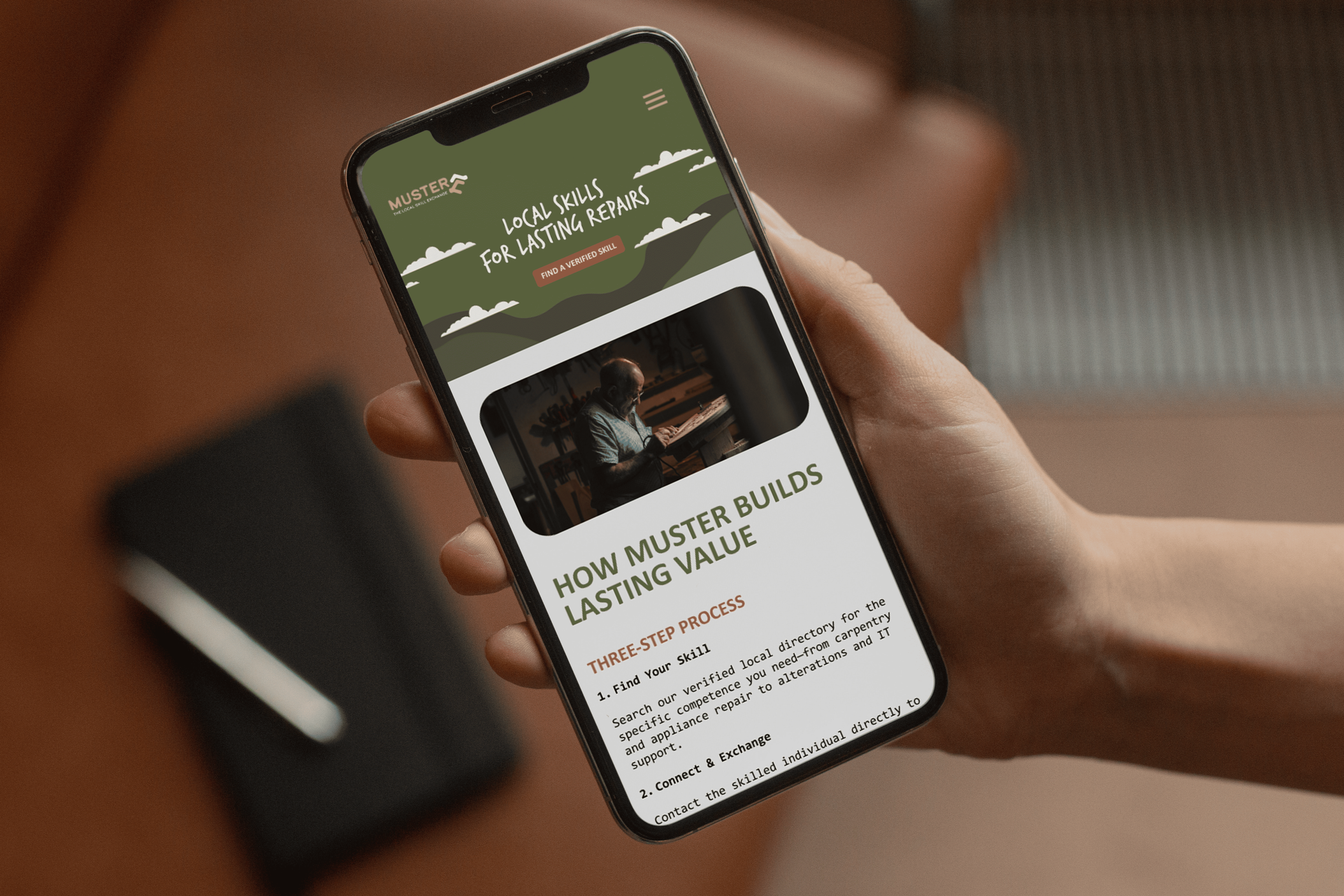
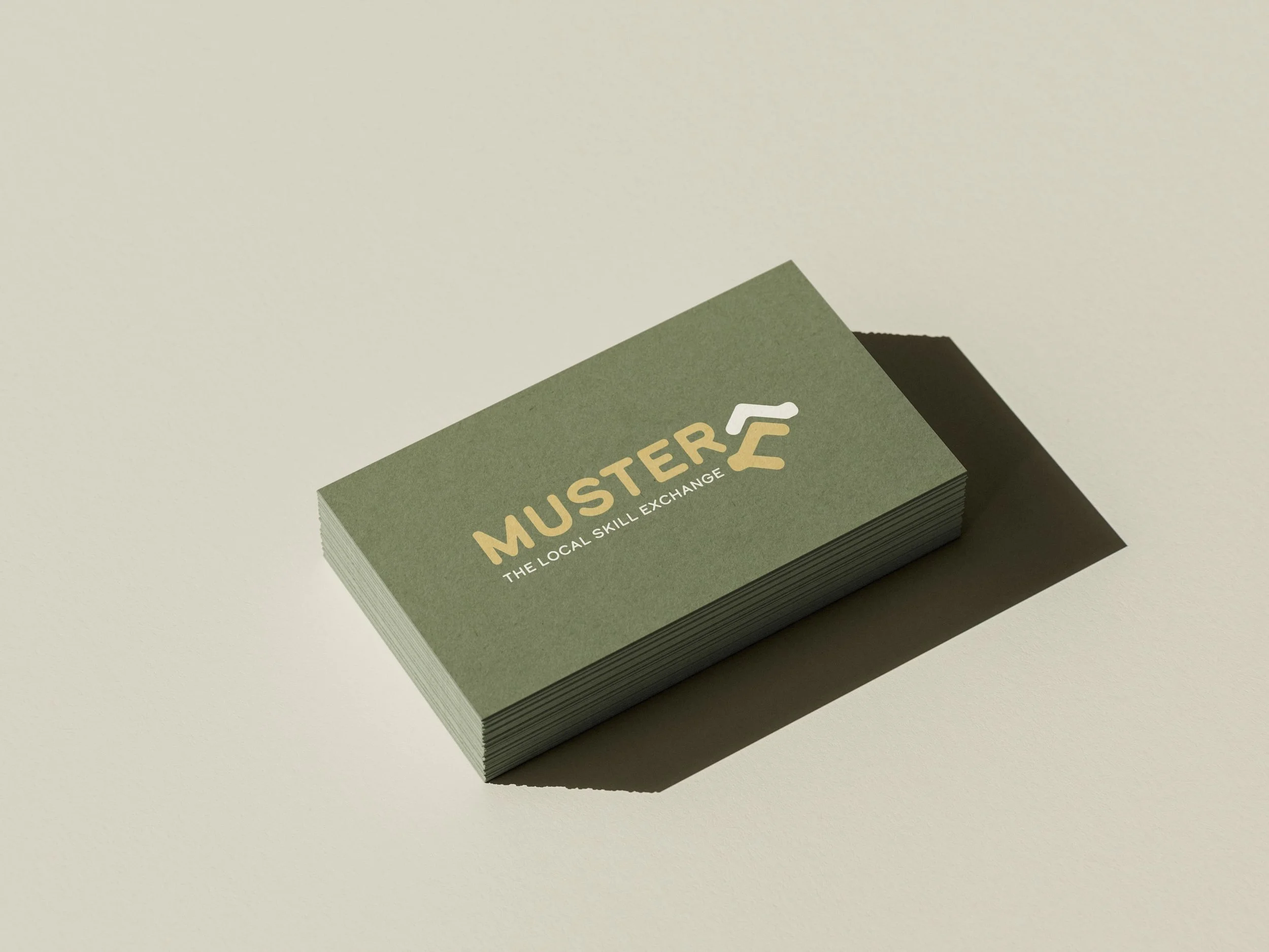
Once the logo direction was established, the identity was vectorised and paired with a natural, earthy colour palette inspired by the Australian landscape, reinforcing reliability and environmental responsibility. Typography was chosen to balance modern clarity with a sense of durability and approachability.
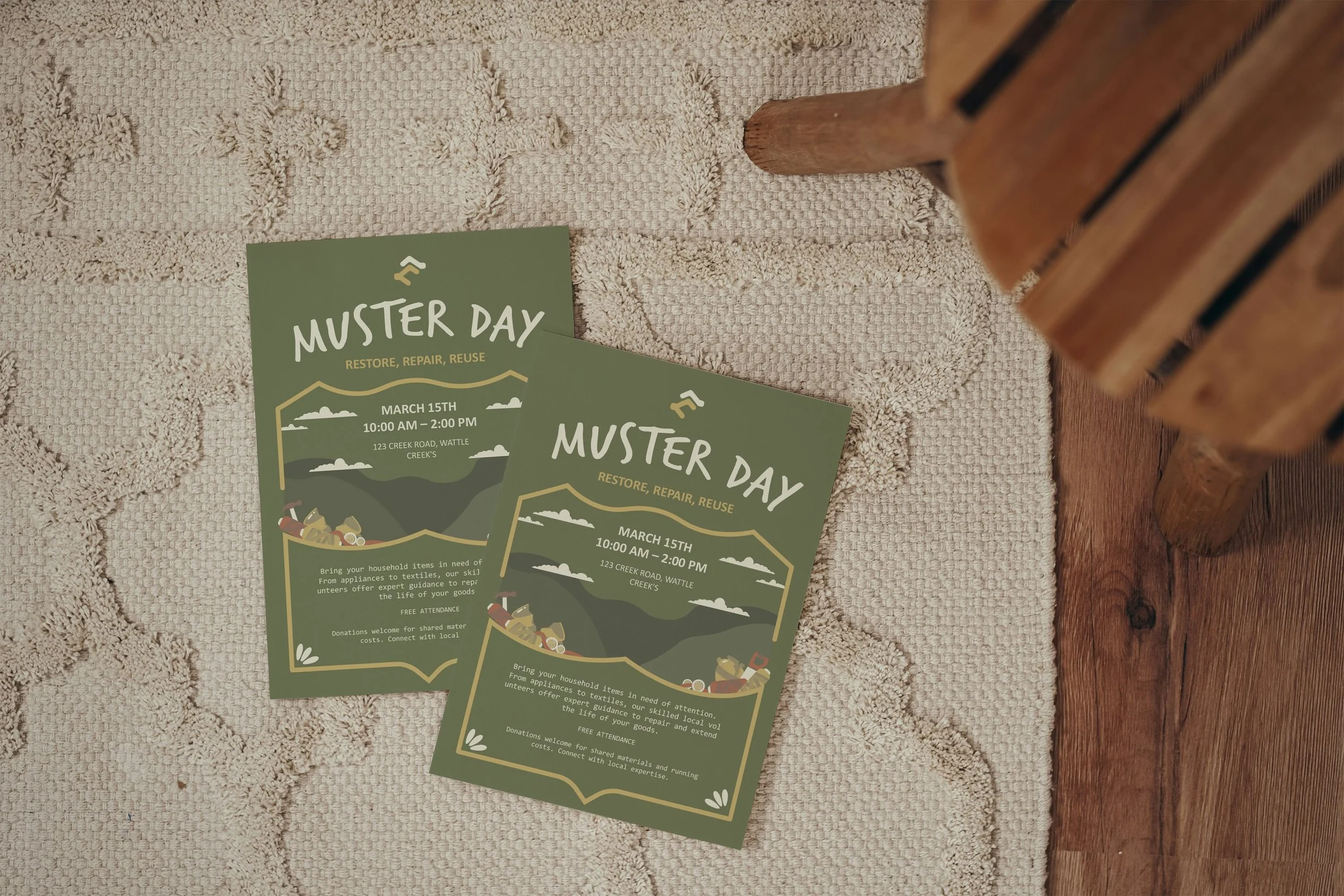
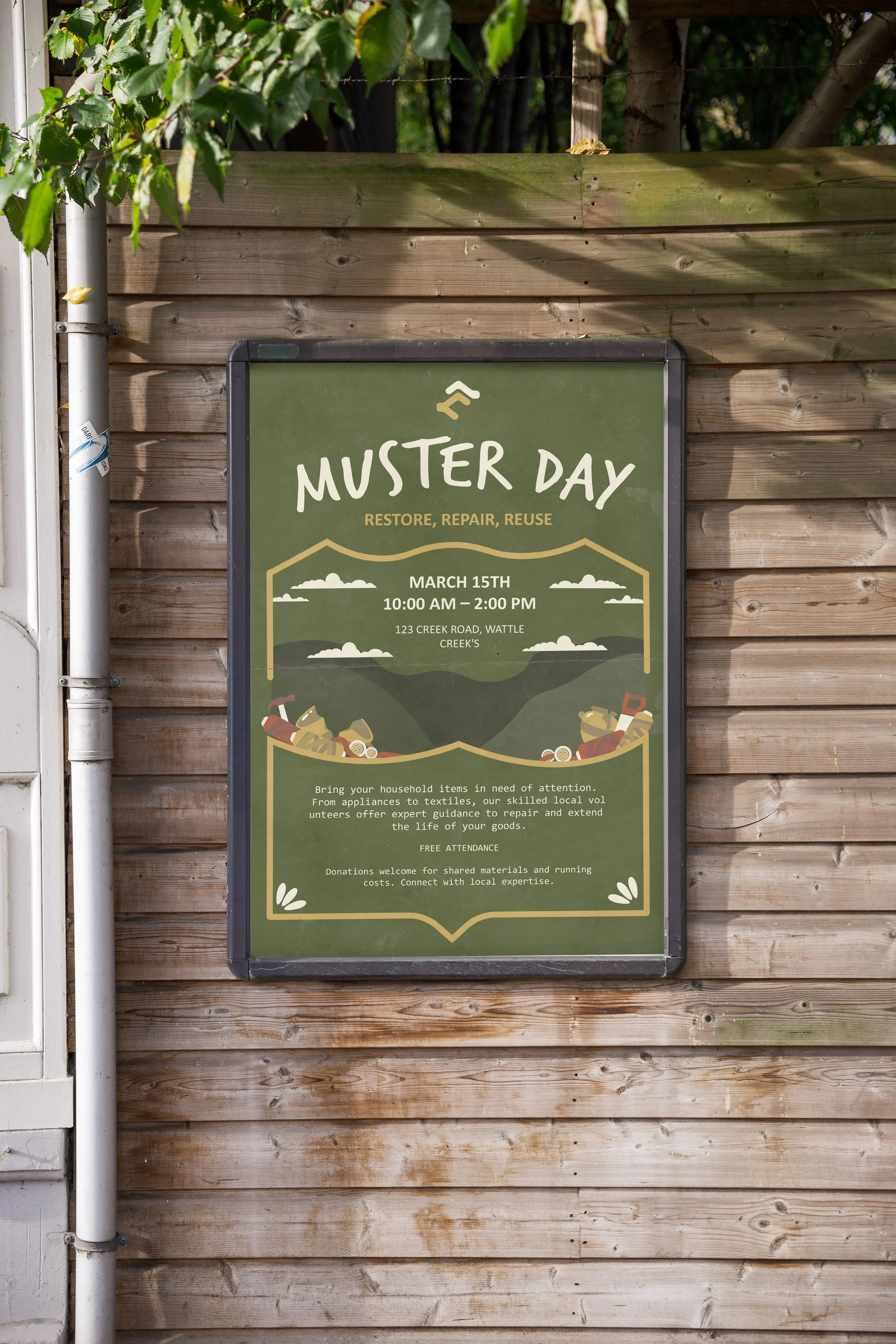
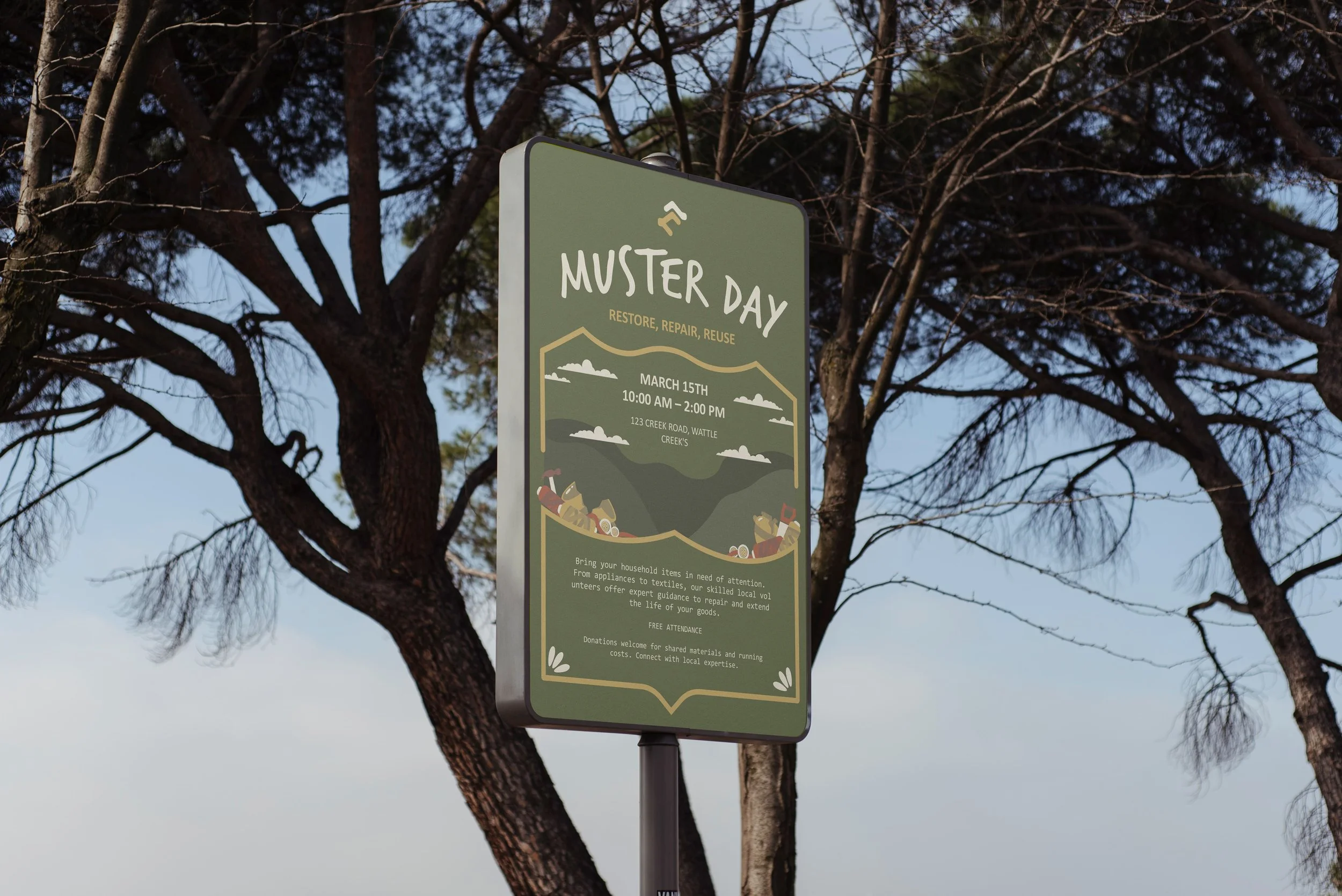
From there, the identity was extended into practical applications, including posters for community “Muster Days.” These were influenced by vintage rural posters, using illustration and strong layout rather than photography to create interest, accessibility, and a sense of shared history.
-
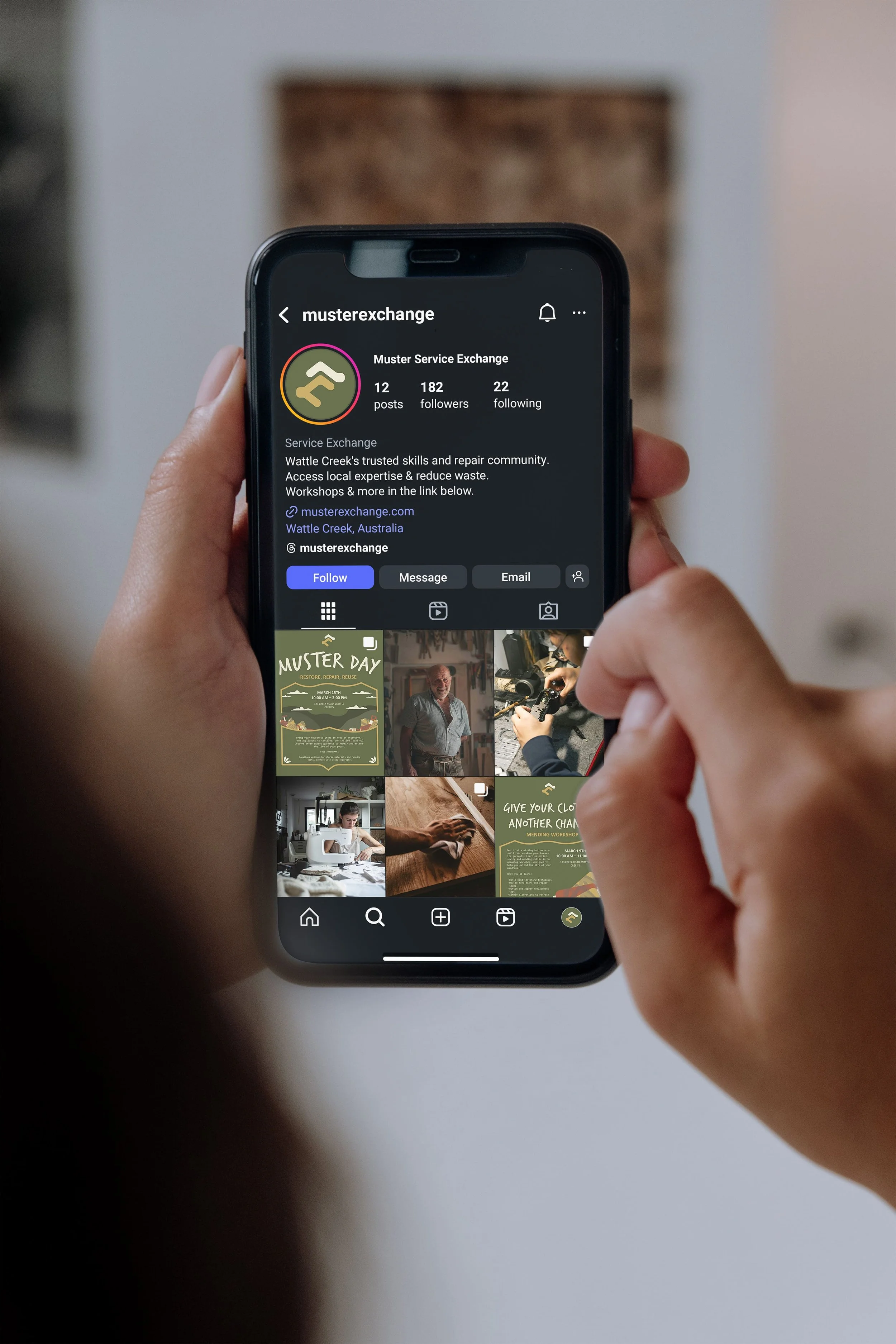
The visual system was intentionally designed to move away from overly polished imagery and instead rely on illustration, iconography, and layout to communicate purpose. This approach made the brand feel inclusive and timeless, while also reducing reliance on stock photography or individual personalities.
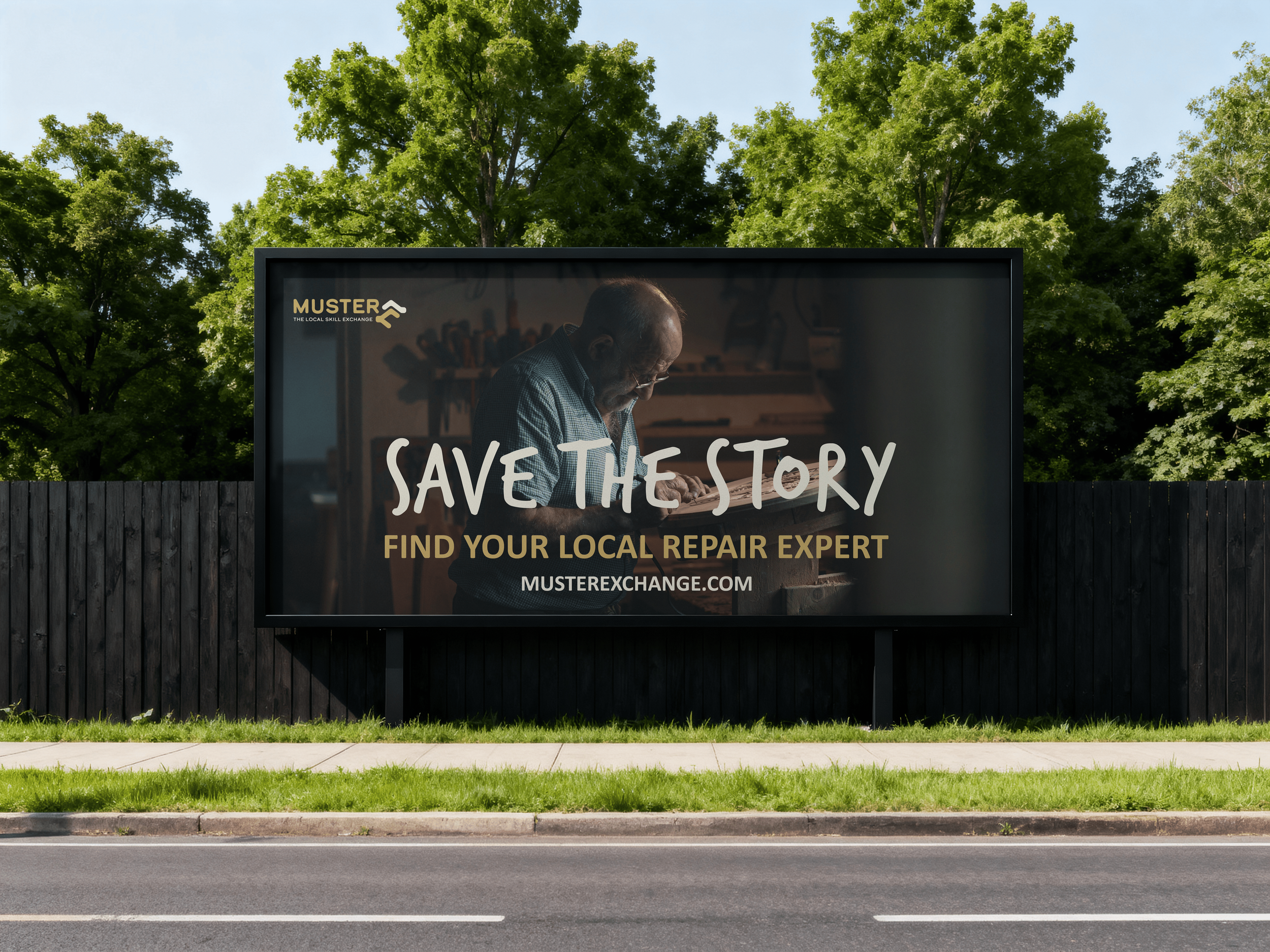
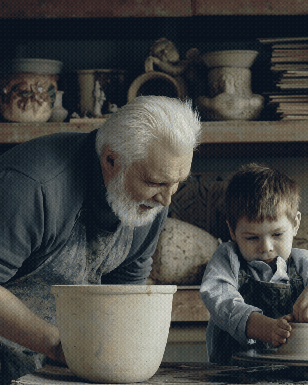
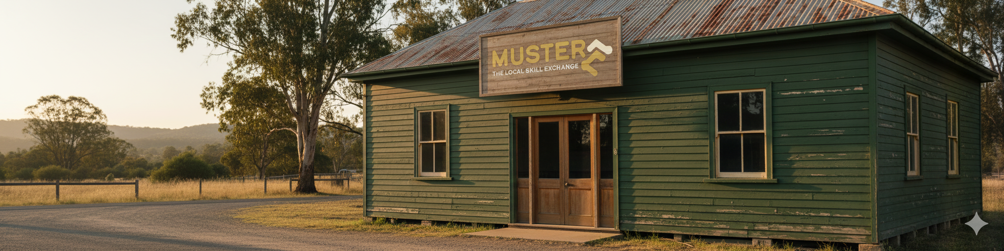
Illustrated elements and custom icons were developed to support clarity and wayfinding across posters, signage, and digital platforms. For larger-scale applications such as billboards, photography was introduced selectively to evoke the story, mystery, and craftsmanship behind mending and repair, grounding the brand in real human narratives.
Across all touchpoints, the design maintained a consistent tone: professional but not corporate, friendly but not casual, and principled without being preachy.
-
The outcome was a cohesive, modern brand identity that positions Muster as a trusted, community-first service rather than a hobby group or informal network. The system supports recognition, clarity, and confidence, helping residents understand both the purpose of the platform and how to engage with it.
Beyond aesthetics, the brand reinforces a broader cultural shift toward reuse, repair, and local knowledge-sharing. By making mending visible, accessible, and valued, Muster helps strengthen community ties, reduce waste, and promote a more sustainable relationship with both objects and people.
The identity now acts as a foundation for ongoing growth, ensuring Muster remains recognisable, credible, and aligned with its mission to protect stories, skills, and the planet.