
GROUNDSTATE
Role: Designer
Type: Visual Identity
Year: 2025
Transforming wellness into a connected, sustainable experience
Groundstate is a mindful trail-running brand built to reflect both physical endurance and inner presence. The founder wanted to move away from the standard "performance-driven fitness" aesthetic and create something more authentic, grounded in values, and visually distinct, with a particular emphasis on the sensory textures of the earth and the symbolism of dialogue between body and nature.
-
The project started with a deep conversation about what Groundstate truly meant, movement as presence, not performance. We explored the brand's vision, mission, and values of balance, rhythm, and belonging. What became clear early on was that this wasn't about building another running club. It was about creating a guide for people seeking intentional movement, deep listening, and genuine connection to the natural world.
That conversation shaped everything that followed. I dove into research, studying local and international trail-running communities, exploring design languages that felt grounding rather than loud, and analysing how other brands visually represent the connection between body, mind, and earth. The non-negotiables emerged naturally: simplicity and grounding. These weren't just aesthetic choices, they embodied both the mindfulness and endurance that sit at the heart of Groundstate's philosophy.
From there, I moved into sketching, working through dozens of concepts to find a mark that could hold that dialogue between body, mind, and earth through simple, rooted, rhythmic forms.
-
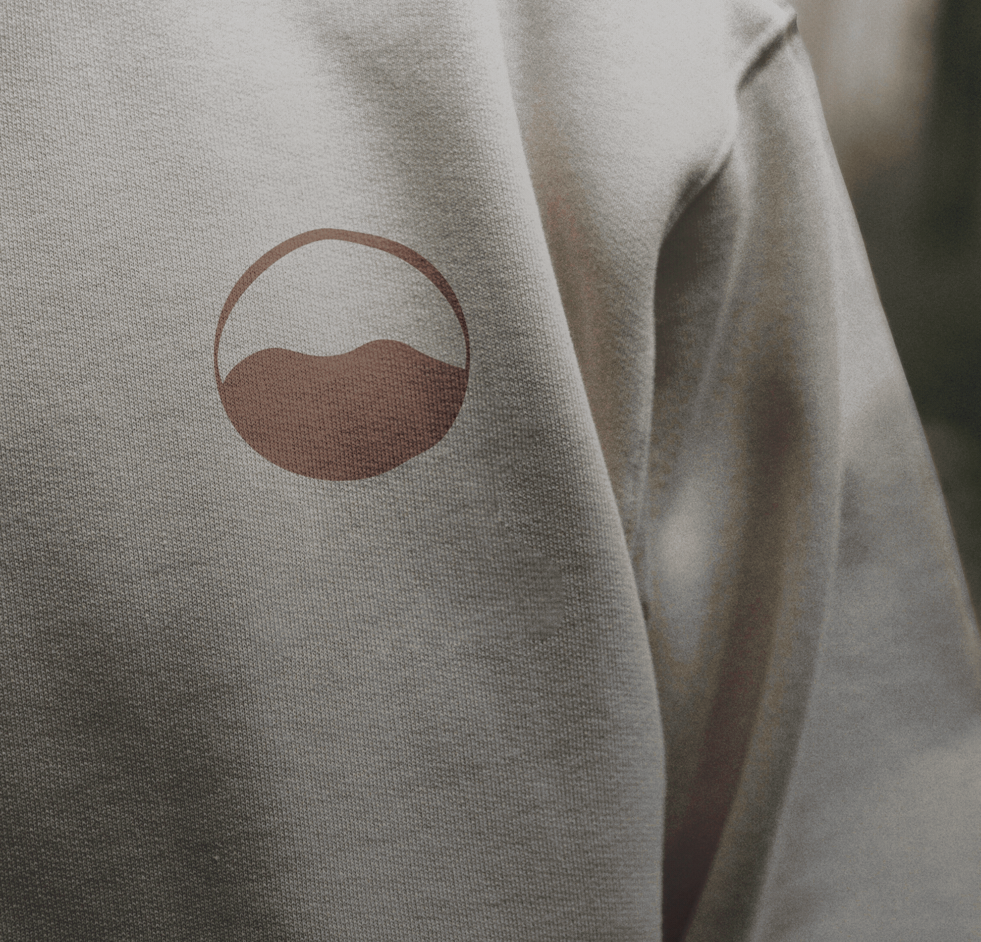
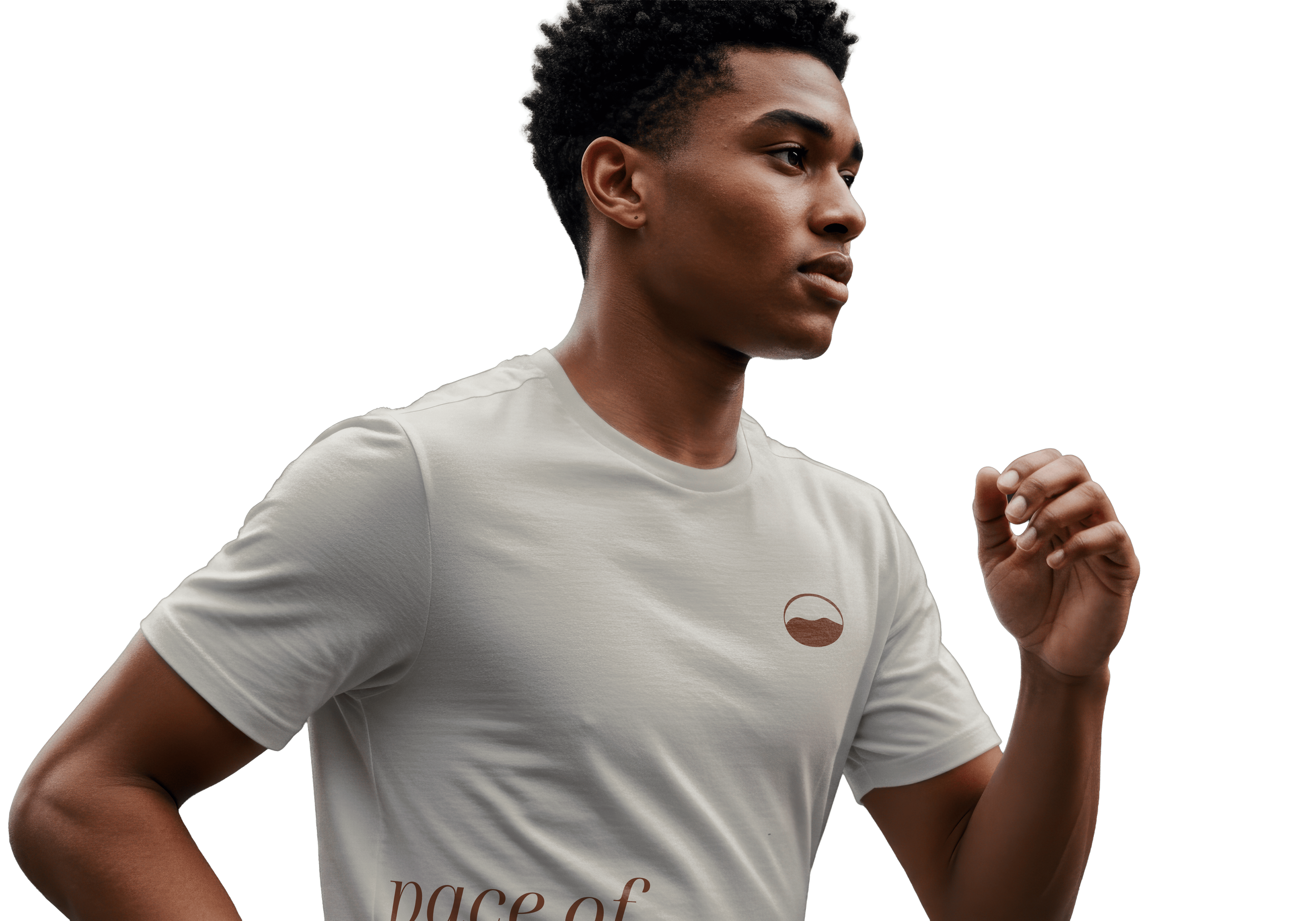
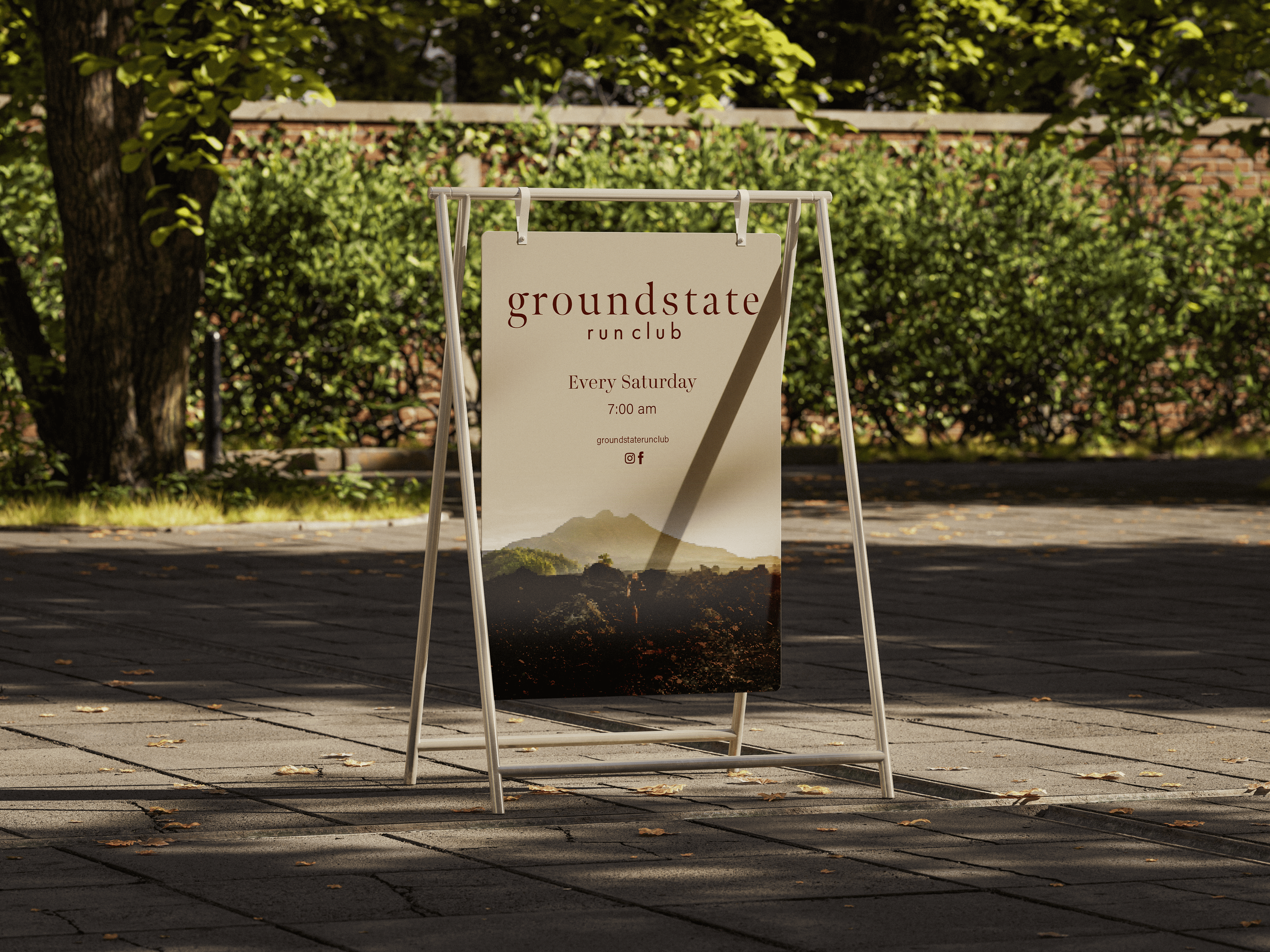
Out of multiple logo directions, the founder chose a mark that genuinely captured what we'd been building toward, something simple, grounded, and unmistakably Groundstate. That core mark evolved into a full visual system: primary logo, supporting symbols, and custom iconography that all worked together.
I selected sans for its humanistic warmth and clarity, then built a colour palette that pulled from the sensory textures of earth and the cool openness of sky. The unused sketches and early concepts found new life as patterns and icons—echoing topographical maps and rhythmic footsteps which created consistency across every brand touchpoint.
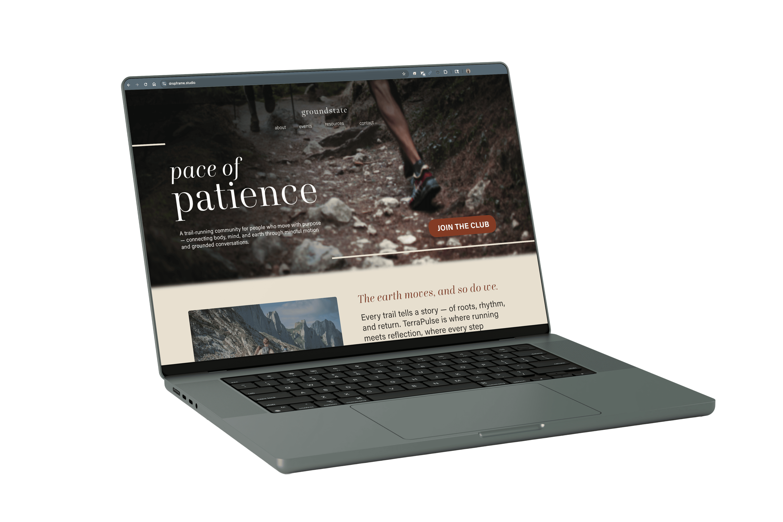
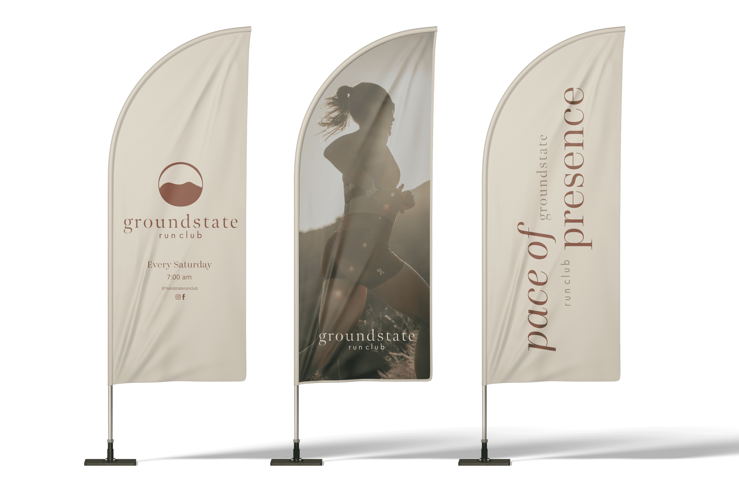
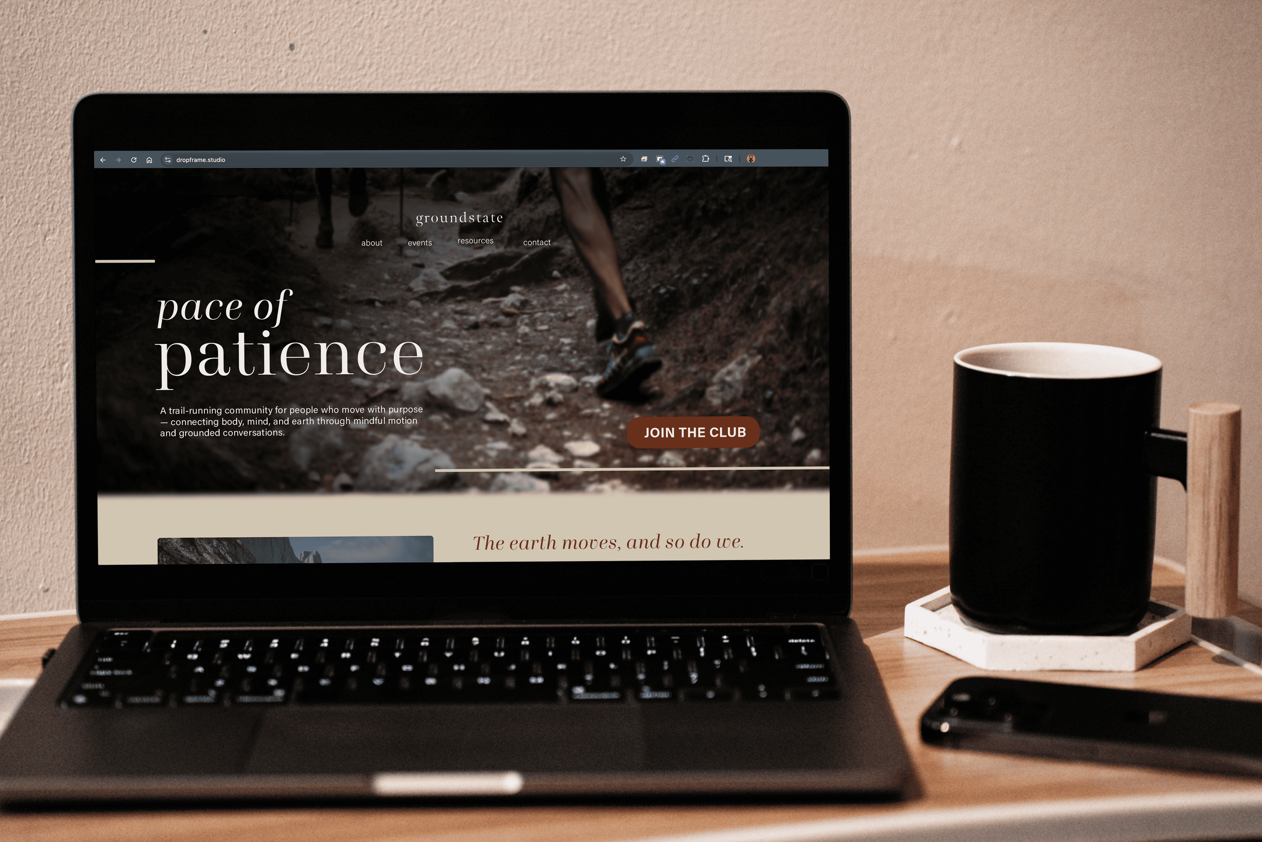
The result was a flexible brand family that could live across digital platforms, apparel, and trail markers while staying deeply connected to the philosophy of intentional movement.
-
The brand gave Groundstate a unique identity that perfectly merges the state of philosophy with the act of running. It set the brand apart from local competition by creating a consistent narrative that doesn't rely on generic fitness tropes. Beyond the visuals, the work provided a compelling voice, story, and theme that ensures the brand can travel globally and last a lifetime, not relying on fleeting trends.
To support this transition, I also created launch collateral, digital assets for community engagement, and a foundational style guide to ensure visual and tonal consistency. This helped position Groundstate not just as another running club, but as a distinct, values-driven offering with a ritual of connection at its core.