
The Dos and Don'ts of Colour in Branding (And Why It Matters So Much)
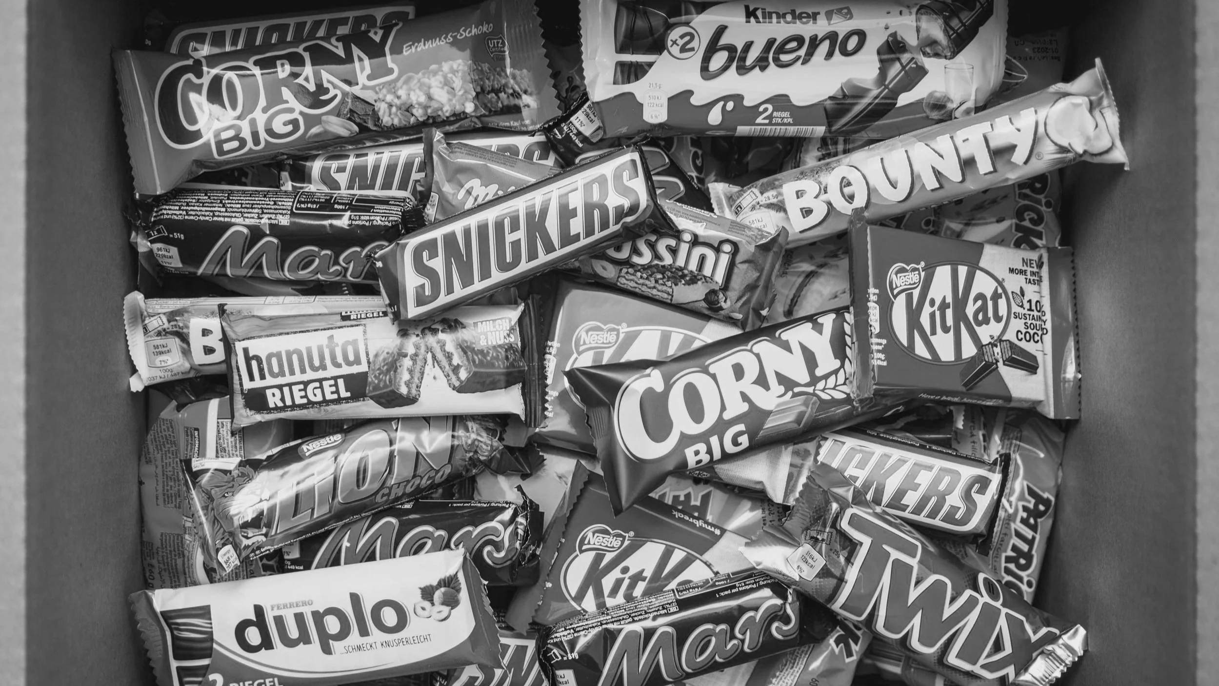
Colour is more than just an aesthetic choice. It’s a language of its own, one that communicates emotions, ideas, and even memories. It’s no surprise that brands like Cadbury have gone so far as to trademark their iconic purple. Colour plays a massive role in branding because it can instantly evoke a feeling, create a connection, and set a brand apart from the competition.
In this blog, we’ll explore the dos and don’ts of using colour in branding and why it’s one of the most important elements when designing your brand identity. Whether you’re designing a new brand or refreshing an existing one, colour can shape how your audience feels about your brand long before they even read your tagline.
Why Colour Matters in Branding
Think about the last time you walked into a store or browsed through a website. The first thing that probably caught your eye was the colour. A well-chosen colour palette can immediately make a lasting impression.
Colour psychology is a key reason why this happens. Different colours evoke different emotions and responses from people. For instance, blue often conveys trust, while red can evoke excitement or urgency. Many brands use colour as part of their identity because they know how powerful it can be to influence consumer behaviour and build a strong emotional connection.

The Dos of Colour in Branding
Do Use Colour to Reflect Your Brand Values
Colour should not be an afterthought—it should reflect the core values and message of your brand. For example, if your brand promotes health and wellness, greens, blues, and earth tones might be the way to go. They are calming and promote a sense of well-being, which can help create trust with your audience.
Example: In my design projects, Body en Soul used purple to symbolize loyalty and connection to self. Purple is often linked to wisdom and spirituality, and it was the perfect choice for a brand that wanted to evoke feelings of depth, inner peace, and strength. We also used variations of purple to evoke calm energy, which fit the brand's message of balance and holistic well-being. A carefully chosen colour can help solidify the message your brand wants to convey.
Do Ensure Consistency Across All Touchpoints
Your brand's colour palette should be consistent across all platforms—websites, social media, packaging, and marketing materials. This creates a cohesive, professional image and helps your audience quickly recognise and connect with your brand.
Example: Olivra, a brand focused on nature and organic living, used shades of green and muted earth tones to convey a sense of nature, organic purity, and sustainability. Their choice of colour helps reinforce their values of environmental responsibility and holistic living.
Do Consider Cultural Differences
Colours may have different meanings in different cultures. For instance, in Western cultures, white is often associated with purity and weddings, while in some Eastern cultures, it’s linked to mourning. Make sure to do your research if your brand will be reaching a global audience.
Do Test Colours in Context
Before rolling out your brand’s colours, test them in various contexts and formats. How does your colour look on a website? On mobile? Printed on packaging? Ensure your colour choices remain effective across all mediums.

The Don'ts of Colour in Branding
Don’t Use Colours for the Sake of Aesthetics Alone
While colours may look appealing, they should have a purpose. Don’t choose a colour simply because you like it. Each colour should be aligned with your brand's personality and values.
Don’t Overcomplicate the Palette
Having too many colours can confuse your audience and dilute your brand’s identity. Stick to a simple, cohesive colour scheme—typically, 2-3 primary colours and 1-2 secondary colours. Too many colours can overwhelm and reduce the effectiveness of your brand messaging.
Don’t Use Inconsistent Colours Across Platforms
Inconsistent use of colours (e.g., changing your logo colour across social media platforms) can confuse your audience and weaken brand recognition. Stick to the same colour palette for all your brand’s materials and platforms to ensure consistency.

Cadbury's Trademarked Purple: A Case Study
When we talk about how powerful colour can be in branding, it’s hard not to mention Cadbury’s iconic purple. The company has gone so far as to trademark the shade of purple used in its packaging. Why? Because it’s so closely linked with their brand identity.
That rich, velvety purple immediately evokes a sense of luxury and indulgence. For customers, it’s not just about chocolate; it’s about the experience of enjoying something special. The trademarked purple reinforces this association and makes Cadbury instantly recognisable.
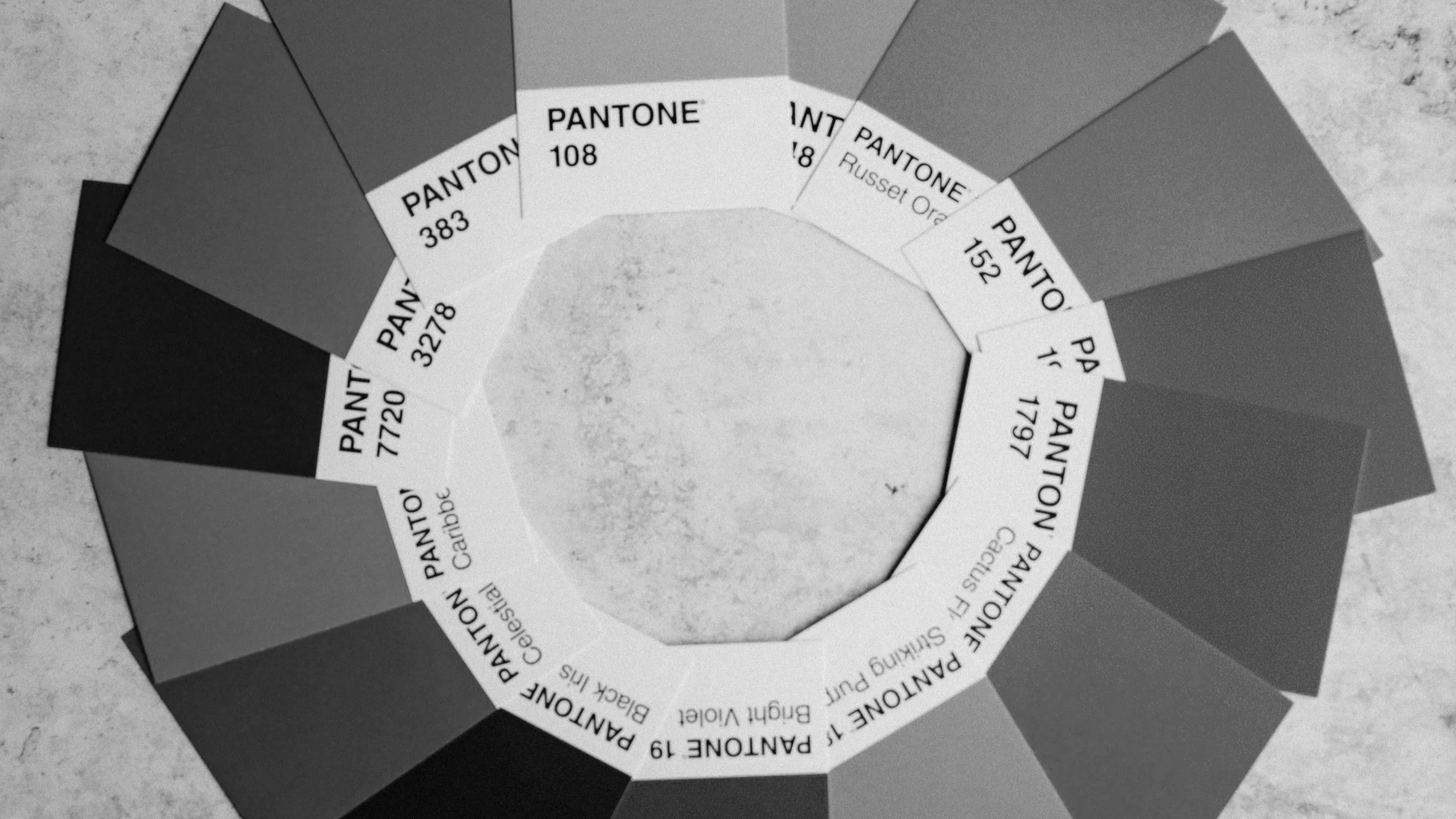
How Colours Can Influence Brand Perception
Let’s break down how colours can influence perception:
Red: Often used to grab attention, it signifies excitement, energy, and urgency. Think of Coca-Cola and Netflix.
Blue: Often used for tech and professional services, blue signifies trust, calmness, and reliability. Brands like IBM and Facebook rely on blue to create trust with their audiences.
Green: Symbolizing growth, nature, and freshness, green is often used by eco-friendly and health-conscious brands. Whole Foods and Olivra exemplify this perfectly.
Yellow: Associated with optimism and happiness, yellow can be great for youthful, energetic brands like McDonald's.
Purple: As discussed, purple signifies luxury, mystery, and creativity. It’s used by brands like Cadbury and T-Mobile to create an air of elegance.
Colour is far more than just a design tool; it’s an integral part of branding. The right colours can evoke emotions, increase recognition, and even build loyalty. Whether you’re designing a brand from scratch or updating an existing one, make sure your colours align with your values, communicate the right message, and create a consistent experience across all touchpoints.
Remember, consistency and purpose are key when choosing your brand colours. Just as Cadbury has solidified its identity through the use of purple, your brand’s colour palette can help you stand out and build a strong emotional connection with your audience.
Resources:
Ignyte Brands. (n.d.). Color Psychology in Branding: The Persuasive Power of Color. Retrieved March 25, 2025, from https://www.ignytebrands.com/the-psychology-of-color-in-branding/
HubSpot. (n.d.). Colour Psychology: How To Use it in Marketing and Branding. Retrieved March 25, 2025, from https://blog.hubspot.com/the-hustle/psychology-of-color
Help Scout. (n.d.). Colour Psychology in Marketing and Branding is All About Context. Retrieved March 25, 2025, from https://www.helpscout.com/blog/psychology-of-color/
Canva. (n.d.). Colour psychology: The logo colour tricks used by top brands & how to .... Retrieved March 25, 2025, from https://www.canva.com/logos/color-psychology-the-logo-color-tricks-used-by-top-companies/
MacRoberts LLP. (n.d.). Cadbury: Trade Mark & Branding. Retrieved March 25, 2025, from https://www.mfmac.com/insights/food-drink/cadburys-successful-trade-mark-protection-for-specific-colours-what-does-this-mean-for-brands/
City A.M. (n.d.). Cadbury's allowed to register iconic purple colour trade mark in High Court ruling. Retrieved March 25, 2025, from https://www.cityam.com/cadburys-allowed-to-register-iconic-purple-colour-trade-mark-in-high-court-ruling/
Adobe Express. (n.d.). Colour Psychology in Marketing. Retrieved March 25, 2025, from https://www.adobe.com/uk/express/learn/blog/colour-psychology-in-marketing
A&O Shearman. (n.d.). Nestle v Cadbury: The colour purple. Retrieved March 25, 2025, from https://www.aoshearman.com/insights/nestle-v-cadbury-the-colour-purple
Forbes. (n.d.). 5 Ways You Can Use Color To Build Brand Identity. Retrieved March 25, 2025, from https://www.forbes.com/councils/forbestechcouncil/2023/08/03/the-psychology-of-color-5-ways-you-can-use-color-to-build-brand-identity/
Confectionery News. (n.d.). Cadbury drops its trademark claim over the purple wrapper. Retrieved March 25, 2025, from https://www.confectionerynews.com/Article/2019/02/05/Cadbury-drops-its-trademark-claim-over-purple-wrapper/
DesignRush. (n.d.). Color Psychology: How To Choose the Right Colors for Your Brand. Retrieved March 25, 2025, from https://www.designrush.com/agency/logo-branding/trends/color-psychology-in-branding